Logos are such a simple and effective statement to show off who you are. I've always been interested in logo design and what goes into it. I've had the benefit of working with professional graphic designers at Fireside21 and seeing the process in action. Many times we'll start with an abstract statement of goals for the logo and inspiration. Then we'll do a call that goes over the specifics - for example, this committee covers these 3 main issue areas and so we need to incorporate something from all of those. The designers will then come up with multiple different concepts driven by that conversation. They might be literal - icons for specific topics, or they might be more abstract with shapes that evoke an idea without explicitly using that iconography. Then we have to work with the relevant stakeholders and get their sign off.
Mostly this has worked well as a process, but sometimes at the last minute a new stakeholder will come in and blow up the process since their vision is completely different than the folks we have worked with. Typically age also is a factor - the more senior stakeholders may have delegated the project, then changed their mind about being hands off at the last minute and they want a more staid design. Thank goodness for hourly billing contracts amirite?
Fortunately/Unfortunately when designing a logo for myself, I don't have different stakeholders to engage with instead I get to be both the designer and the decision maker. For myself, I looked to different inspiration online. I have an eclectic group of interests and topics that I want to display on this site, but I also have an uncommon name for an American. As such, I decided to use the letters in my name as a base to work off of since that's something that is uniquely me and unchanging.
I really like symmetry and on tiktok (Where I get inspired by really creative content) I ran across Cami Creative who turns different words and names into shapes. I really enjoyed her videos, and decided that I could adapt her style to making an animated logo with SVG and CSS for my name.
@cami.creative Reply to @sarahdubs4 ##namelogo for Elise! this one has kind of a 3D feel! (also my color-coordinated feed makes me SO happy) ##logo ##logodesign ##fyp
♬ ily (i love you baby) - Surf Mesa
I started with paper and pen to iterate quickly on varying patterns. My goal was to achieve a symmetric design that incorporated each letter of my name. I got stuck for a bit on symmetry, what finally got me headed in the right direction is that I broke down each letter into constituent shapes that were as simple as possible. I discovered that my first name has 5 vertical lines, 5 horizontal lines, 2 diagonal lines, 2 left semi-circles, 1 right semi-circle, and 1 full circle. That got me to experiment with just those specific shapes in different orders and overlapping, and then to form those together into a cohesive design.
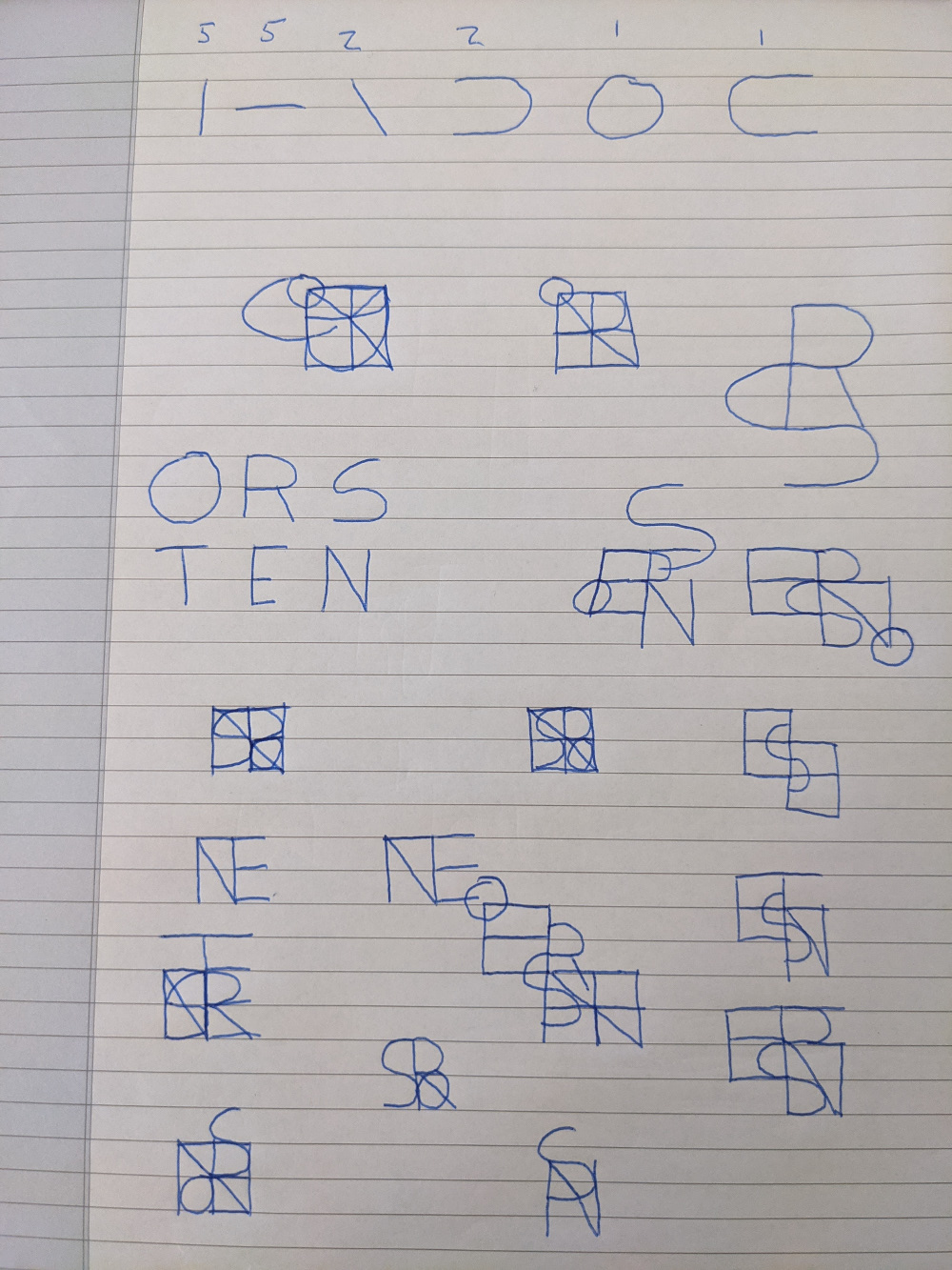
I ended up with a box with a +, two ovals, and a diagonal line inside. This was pleasing to me as it is symmetrical, fits into an easy to manipulate area, and achieves my goals for balance.